
Introduction
You have probably typed a one-line description into an AI image tool and watched it produce something unexpected. Not wrong exactly – but not what you had in mind either.
That gap is common. Most text-to-image tools work well when the prompt is specific. When the prompt is vague, the tool fills in missing details on its own. The results can vary significantly.
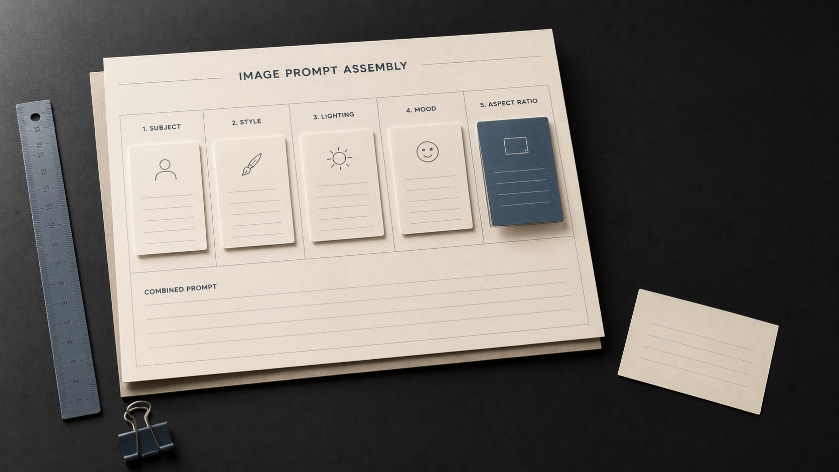
The good news is that there is a clear structure for writing a text-to-image prompt. It has five components. Once you know what they are and what each one does, you can apply them to any image you need – product visuals, course graphics, social posts, or editorial illustrations.
This article walks you through those five components step by step. By the end, you will be able to build a complete text-to-image prompt from scratch using a consistent, repeatable approach.
Why Structure Matters in Visual Prompting
Text prompting and visual prompting feel similar at first. Both involve writing instructions in plain language. But they work differently.
When you write a text prompt, the tool produces language. Words go in, words come out. The output lives in the same medium as the input.
When you write a visual prompt, words go in but an image comes out. You are using language to describe something that exists in a completely different medium. That shift means you need to be explicit about visual details that a text prompt never requires.
Compare these two prompts:
| Prompt | A photo of a cafe. |
| Prompt | A wide-angle photograph of a small neighbourhood cafe, warm afternoon light through large windows, wooden tables and chairs, cosy and quiet atmosphere, slightly warm colour tones, 4:3 aspect ratio. |
Both prompts describe the same subject. In many cases, Prompt B tends to produce a more consistent and usable result. Prompt A leaves the style, lighting, mood, and format entirely to the tool. The tool will make choices – but those choices may not match what you had in mind.
Key Principle
A text-to-image prompt does not guarantee a specific output. Visual AI tools produce probabilistic results. Structure improves the odds of a useful output – it does not eliminate variation. Use structure to guide the tool, then iterate based on results.
The Five Components of a Text-to-Image Prompt
A well-structured text-to-image prompt covers five distinct dimensions of the visual output. Each component handles a different aspect of what the image looks like.
| Component | What It Controls |
|---|---|
| 1. Subject | Who or what appears in the image, and where the scene is set |
| 2. Style | The artistic or photographic treatment of the image |
| 3. Lighting | The quality, direction, and character of the light in the scene |
| 4. Mood | The emotional register or atmosphere of the image |
| 5. Aspect Ratio | The dimensions of the output (width-to-height ratio) |
You do not need all five components for every image. Start with subject and style. Add lighting, mood, and aspect ratio as your use case requires. Adding more components generally gives the tool more to work with – but the goal is specificity, not length.
Step-by-Step: Building a Prompt from Scratch
The steps below walk through each component individually, then show how they combine into a complete prompt. The example scenario is a blog header image for an article about remote working.
Step 1 – Define the Subject
The subject is the foundation of your prompt. It describes who or what appears in the image and sets the scene.
Be specific about:
- Who is in the image (a person, an object, a scene, an environment)
- What they are doing or what state they are in
- Where the scene is set
| Prompt | A person at a desk. |
| Prompt | A mid-career professional woman reviewing documents at a glass desk in a quiet, sunlit home office. |
Notice the difference. The specific version tells the tool the subject type, what she is doing, the furniture, and the setting. The vague version leaves all of those decisions open.
Step 2 – Choose a Style
Style describes the visual treatment of the image. It is one of the most influential components. Naming a specific style type tends to anchor the aesthetic more reliably than adjectives like ‘modern’ or ‘clean.’
Common style descriptors include:
- Documentary photography style
- Watercolour illustration
- Graphic novel illustration
- Realistic editorial illustration
- Flat-lay product photograph
- Corporate stock photography style
| Prompt | Realistic editorial illustration style, slightly muted colour palette. |
A style descriptor is not a guarantee. Different tools interpret the same style term in different ways. Treat style descriptors as useful anchors, not precise specifications.
Step 3 – Specify the Lighting
Lighting shapes mood and realism. It is easy to overlook, but it has a significant effect on the output.
Avoid vague lighting instructions like ‘good lighting’ or ‘nice light.’ Specify:
- The light source (window, sun, lamp, overhead, side)
- The quality (soft, diffused, harsh, dramatic)
- The direction (from the left, from above, backlighting)
| Prompt | Bright, diffused natural light coming from a large window on the right. |
Directional cues like ‘from the left’ or ‘overhead’ often produce noticeably different outputs even when the subject stays the same. Lighting and mood work closely together.
Step 4 – Set the Mood
Mood describes the emotional register of the image – the feeling it creates. It works alongside lighting and subject to create coherence across the visual elements.
Examples of mood descriptors:
- Calm, focused, and considered
- Energetic and dynamic
- Warm and approachable
- Minimal and corporate
- Contemplative and quiet
| Prompt | Calm, focused, and considered atmosphere. |
In many cases, mood descriptors shift the overall feeling of the output even when the subject and lighting remain identical. This is one of the most impactful components to experiment with during iteration.
Step 5 – Set the Aspect Ratio
Aspect ratio controls the dimensions of the output. Use the right ratio for where the image will be used.
| Aspect Ratio | Best Used For |
|---|---|
| 16:9 | Blog headers, video thumbnails, presentation slides, landscape web images |
| 1:1 | Instagram posts, social media squares, profile graphics |
| 9:16 | Instagram Stories, TikTok backgrounds, mobile-first vertical content |
| 4:3 | Standard presentation format, document headers, course materials |
| Prompt | 4:3 aspect ratio. |
Most text-to-image tools accept aspect ratio as a prompt modifier, though the syntax varies by platform. Some use ratios like ’16:9.’ Others use terms like ‘landscape’ or ‘portrait.’ Check the documentation for the tool you are using.
Putting It Together: The Complete Prompt
Here is the full prompt assembled from all five components, using the remote working example from the steps above.
| Component | Content |
|---|---|
| Subject | A mid-career professional woman reviewing documents at a glass desk in a quiet, sunlit home office. |
| Style | Realistic editorial illustration style, slightly muted colour palette. |
| Lighting | Bright, diffused natural light coming from a large window on the right. |
| Mood | Calm, focused, and considered atmosphere. |
| Aspect Ratio | 4:3 aspect ratio. |
Written as a single prompt:
| Prompt | A mid-career professional woman reviewing documents at a glass desk in a quiet, sunlit home office. Realistic editorial illustration style, slightly muted colour palette. Bright, diffused natural light coming from a large window on the right. Calm, focused, and considered atmosphere. 4:3 aspect ratio. |
What This Prompt Does
Subject defines who appears, what they are doing, and where.
Style anchors the visual treatment.
Lighting specifies quality and direction.
Mood describes the emotional register.
Aspect Ratio sets the output dimensions for the intended use case.
This structure does not guarantee a specific output. Visual AI tools produce probabilistic results, and even the same prompt can yield variation across runs. The structure improves the odds of a useful output – it does not eliminate variation.
Applying the Structure: Three Practice Scenarios
The five-component structure works across different image types and use cases. Here are three brief examples to show how the components adapt.
Scenario A: Social Media Post (Product)
| Prompt | A flat-lay product photograph of a kraft paper coffee bag on a dark wood surface. Natural side lighting. Shallow depth of field, muted earth tones. Warm and considered atmosphere. 1:1 aspect ratio. |
Scenario B: Course Graphic (Illustration)
| Prompt | A person reviewing a flowchart on a whiteboard in a bright, open meeting room. Graphic novel illustration style, clean lines, limited colour palette. Overhead fluorescent light, clean and clinical quality. Focused and engaged atmosphere. 16:9 aspect ratio. |
Scenario C: Blog Header (Photography Style)
| Prompt | A wide-angle photograph of a modern city skyline at golden hour. Warm orange light reflecting off glass buildings, slightly hazy atmosphere. Shot from street level looking upward. Dynamic and expansive atmosphere. 16:9 aspect ratio. |
Notice that each example applies the same five components in the same order. The content of each component changes based on the use case – the structure stays the same.
Common Mistakes to Avoid
Mistake 1: Using abstract descriptors instead of specific visual language
Avoid: “modern,” “professional,” “nice,” “clean,” “good lighting.”
Use instead: Specific style types, named lighting conditions, directional cues, and mood language.
Mistake 2: Including only a subject description
Many beginners write a subject and stop there. The tool still produces an image – but the style, lighting, mood, and format are all decided by the tool, not by you. Even adding one more component (typically style) tends to narrow the output range noticeably.
Mistake 3: Expecting the same prompt to work across all tools
Different text-to-image tools interpret prompts differently. A prompt that produces a clean editorial result in one tool may produce something quite different in another. When you switch tools, test your prompt first without changes, observe the output, and then adjust your modifiers based on how that tool responds.
Mistake 4: Writing the prompt as a single run-on sentence
Separating components clearly – either by using a period after each component or by labelling them – makes the structure easier to read and iterate. When results are not what you expected, a clearly structured prompt makes it easier to identify which component to adjust.
Key Takeaways
- Visual prompting is structurally different from text prompting. Language must describe what an image looks like, not just what it is about.
- A complete text-to-image prompt typically includes five components: subject, style, lighting, mood, and aspect ratio.
- Each component controls a different dimension of the visual output. Adding more components gives the tool more to work with.
- You do not need all five components every time. Start with subject and style. Add the others as your use case requires.
- Structure improves the odds of a useful output. It does not eliminate variation – visual AI tools produce probabilistic results.
- Apply the same five-component structure across different image types and use cases. The content of each component changes; the structure stays the same.